Training Seminar 4 - Western Melbourne, Victoria
Session Information
Case Study Site: Western Melbourne, Victoria
Recorded on Wednesday 21 November 2019 | 2:30pm ADST
Instructions
TARGET is an urban heat island model, which posses faster runtime and a simplified algorithm set in comparison to other microclimate models, enabling it to quickly analyse air temperature at the neighbourhood to precinct scale (see here for more information). As part of this training seminar we will run the implementation of TARGET within the Scenario Tool, and by doing so, will also be taken through the Scenario Tool’s new user interface and how to create projects and set up scenarios through it.
Creating a New Project
Before beginning, use the link to this Dropbox folder to access the GIS files employed as part of this case study and download them to your computer.
To start, navigate to https://www.wsc-scenario.org.au/ and click on ‘Register’ if you haven’t done so yet (note: you’ll have to re-register for the tool here if you had previously registered for an older iteration of the tool).
Log in using your registration details. You will be taken to the project dashboard – hit the plus button to bring up the new project setup window. Enter a name for your project, and select Melbourne from the dropdown menu for your region. Then click ‘Next’.
Select ‘TARGET’ as your performance assessment and then hit the ‘Next’ button.
Hit the ‘Upload’ button to define the project boundary – then click on anywhere within the dashed area of the ‘Upload boundary’ tab that appears over the satellite imagery displayed. Navigate to wherever the tutorial files are located, and then open the file titled ‘boundary.geojson’. Hit ‘Confirm’ within the tab, and then click on ‘Submit’ when the confirmation window appears.
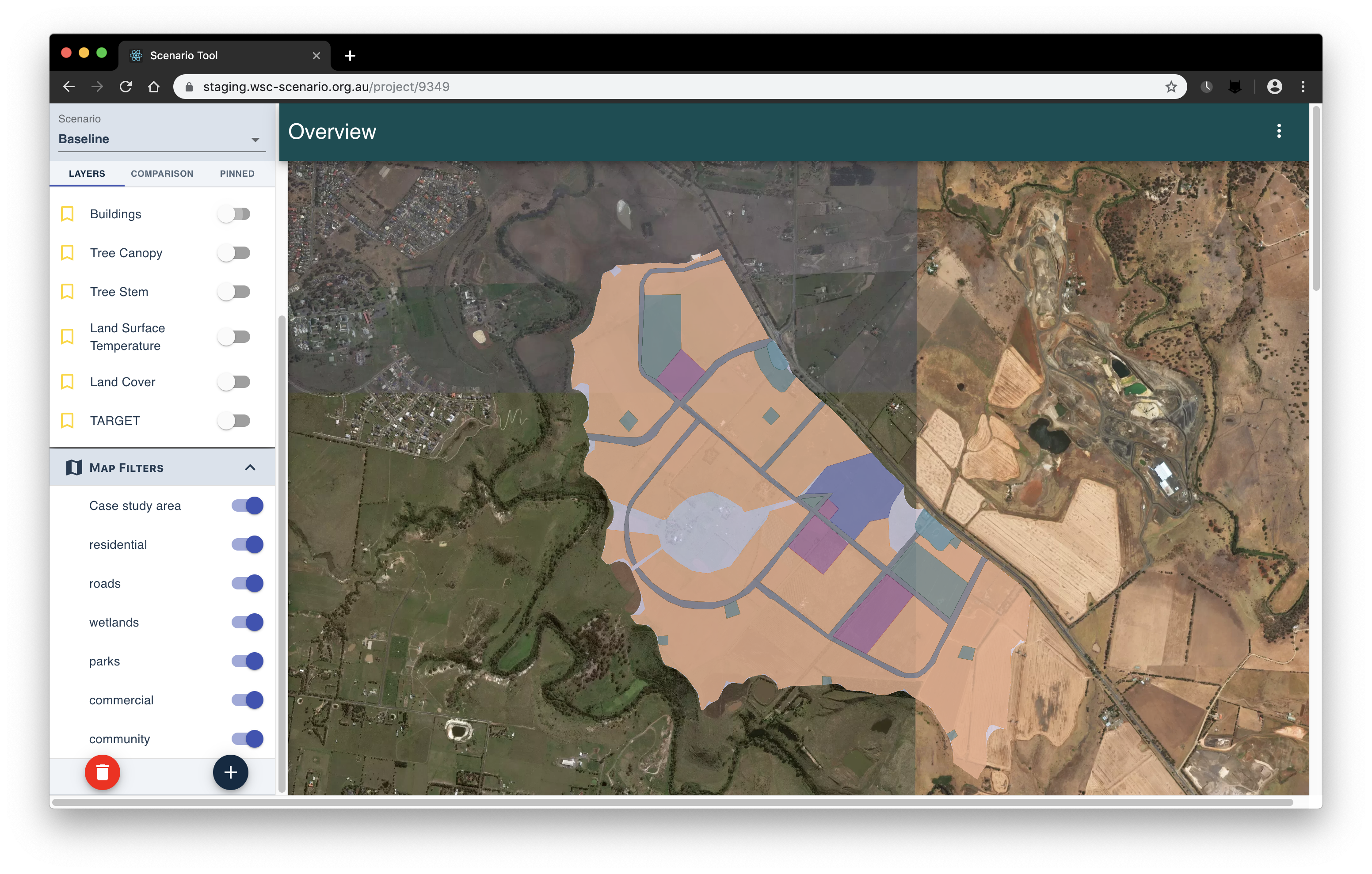
The project will now initialise, with the base case being generated and performance assessments being run on this initial scenario. Once initialisation is completed, the satellite imagery of the main dashboard should be seen. The dashboard contains visualisations of the modelling results, and enables you to manage different scenarios – scroll down to reveal charts and tables pertaining to the baseline conditions of the case study area.
Creating a New Scenario
Before we generate any scenarios, we must specify the possible effect areas for scenario adaption measures (i.e. the spatial extent of different modelling permutations within a scenario). To begin with, hit the plus button underneath ‘Map Filters’ on the left-hand panel. Click on the middle button of those that appear (the ‘Upload’ button), and then click within the dashed area that appears in the panel below the buttons and upload the file ‘commerical.geojson’ as what was done previously with the project boundary. Name the area using the ‘Area name’ field, and choose a colour for the area by clicking on the tile under ‘Area colour’, before hitting ’Submit’. Repeat the described process for the ‘community.geojson’, ‘residents.geojson’, ‘roads.geojson’, ‘parks.geojson’ and ‘wetlands.geojson’ files. Afterwards, confirm that the tool has access to all of the land use areas by activating the respective layers within the ‘Map Filters’ panel with the adjacent toggles.
With the case study’s land use zones uploaded, we can now start to create a BAU scenario for our greenfield development. On the left of the dashboard window, click on the plus button located within the ‘Scenarios’ panel. The ‘Add new scenario’ window should pop up. Enter in a name for the new scenario, and select ‘Baseline’ as the parent scenario for this alternative.
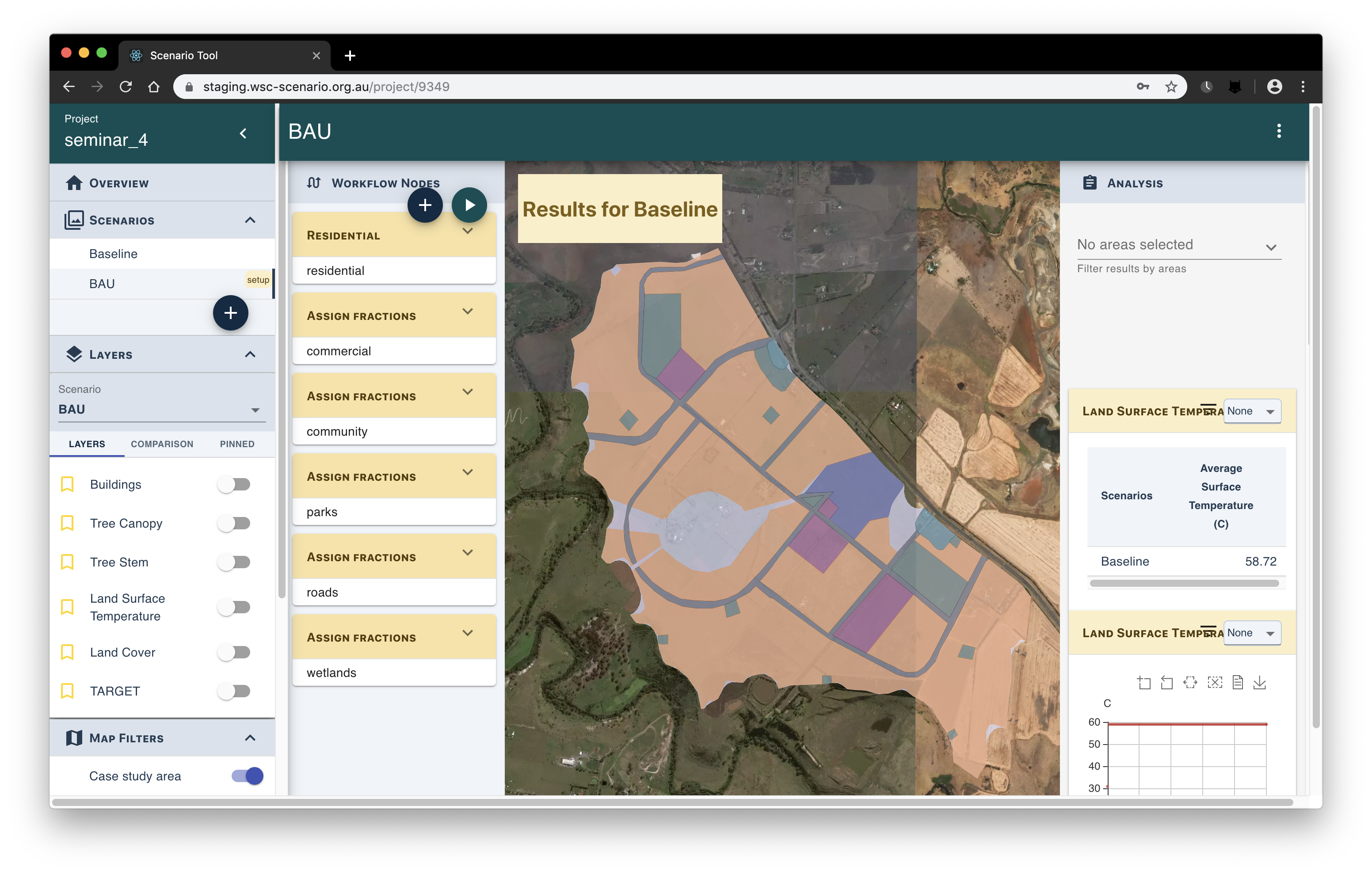
Setting Up a Scenario
You can now begin to configure the scenario you just created – click on its name within the ‘Scenarios’ panel. New panels should appear on the left and the right of the satellite image. Click on the plus button within the ‘Workflow Nodes’ panel – a window displaying different scenario permutation options should appear. Locate the ‘Residential’ node (the dropdown filter in the upper left-hand corner may help – the node comes under ‘Urban Form’) and select it. The ‘Residential’ permutation will now appear in the ‘Workflow Nodes’ panel. Click the arrow on the workflow tab, and you will now be able to set the parameters and area of effect for this node.
For the ‘Residential’ node, set the area of effect to whatever the ‘residential.geojson’ area was named as, and then adopt the following parameter set (leave the values of the unlisted parameters as their defaults):
City block width = 120
City block length = 365
City parcel width = 25
City parcel height = 40
Site coverage = 0.6
Hardstand fraction = 0.5
Irrigation ratio = 0.3
Tree canopy diameter = 2
Percentage of lots with trees = 0
Street tree spacing = 25
After entering in the parameter values for the residential zone, repeat the adding of a workflow node and the subsequent setting of its parameters using the information detailed in the table below.
Workflow Node |
Assign Fractions |
Assign Fractions |
Assign Fractions |
Assign Fractions |
Assign Fractions |
Area |
Commercial |
Community |
Parks |
Roads |
Wetlands |
Tree Cover |
0 |
0.06 |
0.12 |
0 |
0 |
Water Cover |
0 |
0.03 |
0.02 |
0 |
1 |
Grass Cover |
0.02 |
0.16 |
0.77 |
0.3 |
0 |
Irrigated Grass Cover |
0.08 |
0.05 |
0 |
0 |
0 |
Roof Cover |
0.45 |
0.33 |
0.02 |
0 |
0 |
Road Cover |
0 |
0.13 |
0.05 |
0.45 |
0 |
Concrete Cover |
0.45 |
0.24 |
0.02 |
0.25 |
0 |
Once the scenario has been set up with the appropriate workflow nodes as denoted above, hit the play button within the relevant panel to run the model.
We’re interested in how the air temperature compares between the BAU case, and an alternative strategy that implements a green infrastructure initiative. Create a new scenario in the manner described before, though this time specify the previous scenario as the parent. Select the scenario in the panel on the right, and employ an ’Open space irrigation’ node through the ‘Workflow Nodes’ panel. Set the area to the entire case study region and the percentage of dry grass irrigated to 100%, and then run the scenario.
Viewing the Results
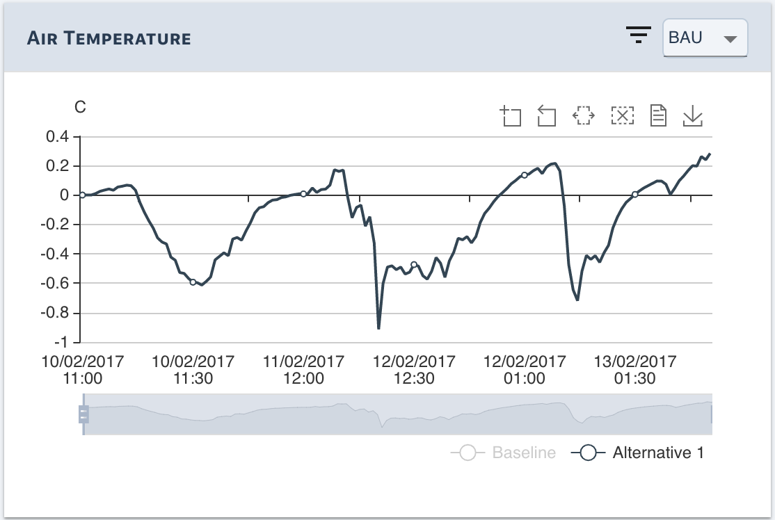
Now that our scenarios have been run, the results may be viewed and compared with each other. Click on ‘Overview’ contained within the leftmost panel, and scroll down past the satellite imagery to peruse the charts and tables populated by the modelling output – witness that the average air temperature for the alternative scenario is about 0.6º cooler than BAU. Also note that we can observe the fluctuations in air temperature for the scenarios over the time period during which they were modelled. We’re able to get a more informative depiction of the air temperature variations by using the comparison feature – click on the dropdown menu displaying ‘None’ within the ‘Air Temperature’ tile, and select ‘BAU’, and then click on the ‘Baseline’ tag that is part of the graph’s legend (this filters out the baseline scenario). We can now see the extent to which the alternative scenario is cooler (and occasionally warmer) than BAU across the three days of modelling.
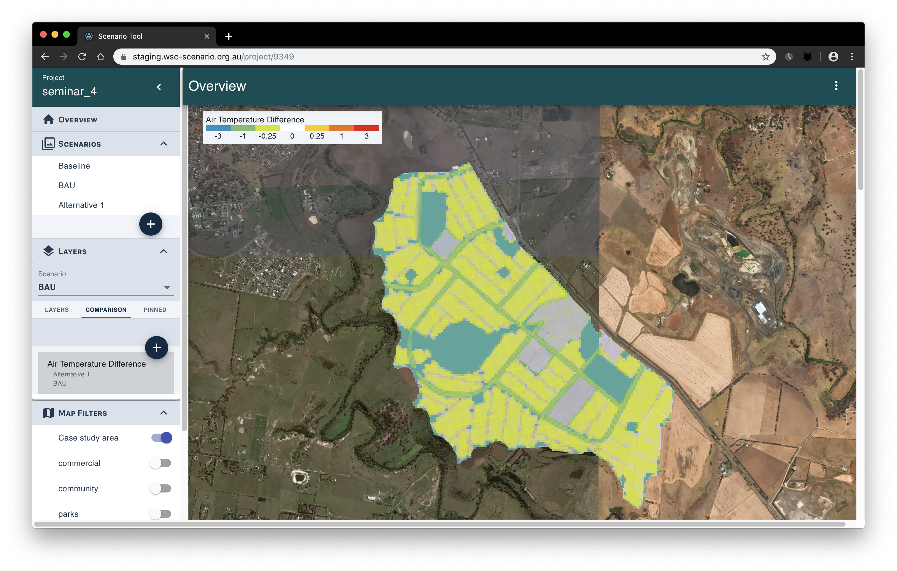
The air temperature modelling results can also be displayed and compared spatially, to gain a better understanding of how regions within the case study respond to different planning decisions or urban form initiatives. Within the ‘Layers’ panel on the left of your browser window, click on ‘Comparison’, and then hit the plus button that appears below. To the right of the ‘Add Scenario Comparison’ window, under ‘Comparison Types’, click on ‘Air Temperature Difference’. In the first dropdown menu (‘Scenario input 1’), select the alternative scenario, and in the second (‘Scenario input 2’), select the BAU case, and then hit the ‘Confirm’ button. ‘Air Temperature Difference’ should now appear under ‘Comparison’ within the ‘Layers’ panel – click on it to publish the gridded air temperature difference map to the dashboard’s satellite imagery (toggle all map filters off except ‘Case study area’ before doing so). The map shows that the air temperature cooling that occurs is proportionate to an area’s dry grass land cover fraction (this is consistent with the adaption node we choose to apply in the alternative scenario).
What’s Next?
You should now have an idea of how to use the tool’s user interface to initiate TARGET modelling and investigate the ensuing results. At this point, feel free to experiment with the myriad visualisation options that are available – activate different map layers in order to depict the urban development that has taken place, filter buildings based on demographic data, create new comparison maps, and so on. You also have the option of creating new scenarios, using various combinations of adaptation nodes to try to bring the case study’s heat profile down or otherwise improve upon the indicators produced through the modelling. For this, nodes characterising the implementation of blue/green infrastructure are usually of benefit – see the list below for suggestions:
Trees on lot
Green roofs
Swales
Rainwater harvesting tanks
Wetland/pond
Alternatively, you can try starting a new project from scratch, bringing in your own GIS files or drawing area boundaries within the tool’s user interface to specify the extent of the case study and/or the different infrastructure strategies pursued within it. The regions could be based around a current project you’re involved in, or could simply be made up on-the-spot – the idea being that TARGET modelling and analysis should still be possible regardless of where or how the areas are defined.